
Blog · 11 October 2026
Finding Simplicity in a World of Powerful Tools
Modern writing tools can do almost anything. But somewhere between endless features and endless customization, it's easy to lose sight of what matters: the writing itself.
We have more powerful software than ever before.
A note-taking app can become a database, a project management system, a personal wiki, or an entire workspace. A writing tool can offer hundreds of settings, dozens of extensions, and countless ways to organize information. With enough time and customization, almost any workflow is possible.
And that's genuinely impressive.
But I've often wondered whether having more possibilities necessarily makes an experience better.
Sometimes, all I want is to open a document and write. I don't want to spend time deciding how the page should look, which features to enable, or how to organize a workspace before I can begin. I want the tool to feel comfortable from the start, while knowing that the capabilities I need will be there when I reach for them.
That sounds like a simple expectation. In practice, it's surprisingly difficult to get right.
It's one of the reasons I started building Ellenote.
When Flexibility Becomes Another Task
Customization is often presented as an unquestionable advantage. More options mean more freedom, and more freedom should mean a better experience.
To a certain extent, that's true.
People work differently, and software should accommodate those differences. Someone writing a research paper has different needs from someone keeping a journal or maintaining technical documentation. The ability to adapt a tool to your workflow can be incredibly valuable.
But flexibility comes with a less obvious cost: someone has to make all those decisions.
Choosing a font, adjusting line spacing, configuring a theme, arranging panels, installing extensions, and deciding how information should be structured can gradually become a project of its own.
None of these tasks is particularly difficult. Some are even enjoyable. Yet every decision asks for a little attention that could have gone toward the work itself.
I've found that there's an important difference between a tool that allows me to create a comfortable environment and one that provides a comfortable environment.
The first gives me the responsibility of designing my experience. The second has already made thoughtful decisions on my behalf, while leaving room for me to change them.
Neither approach is inherently wrong. But I think the second deserves more attention than it often receives.
A good default is not a limitation. It's a form of design.
Simplicity Is Not the Absence of Features
When people talk about simple software, they often mean software with fewer features.
I don't think that's quite right.
A text editor with almost no controls might look beautifully minimal. But if I have to leave it every time I need to navigate a long document, edit a table, find a reference, or reorganize my writing, that simplicity quickly becomes inconvenient.
The complexity hasn't disappeared. It's simply been pushed into my workflow.
To me, simplicity is less about how many things a tool can do and more about how much effort it asks from me to do them.
A capable tool can still feel simple when its features are presented thoughtfully.
When I'm writing, I want to focus on the text. When I need to find something, I want search to be fast and predictable. When I'm working with a table, I want to interact with rows and columns directly, rather than think about the syntax behind them.
I don't need every capability to be visible all the time. I need each one to be accessible when it becomes relevant.
This distinction has shaped many of the decisions I've made while developing Ellenote.
The goal isn't to create the smallest possible editor. It's to create an editor that feels straightforward without becoming restrictive as the work grows more complicated.
That balance is much harder to achieve than simply removing buttons.
The Quiet Importance of Typography
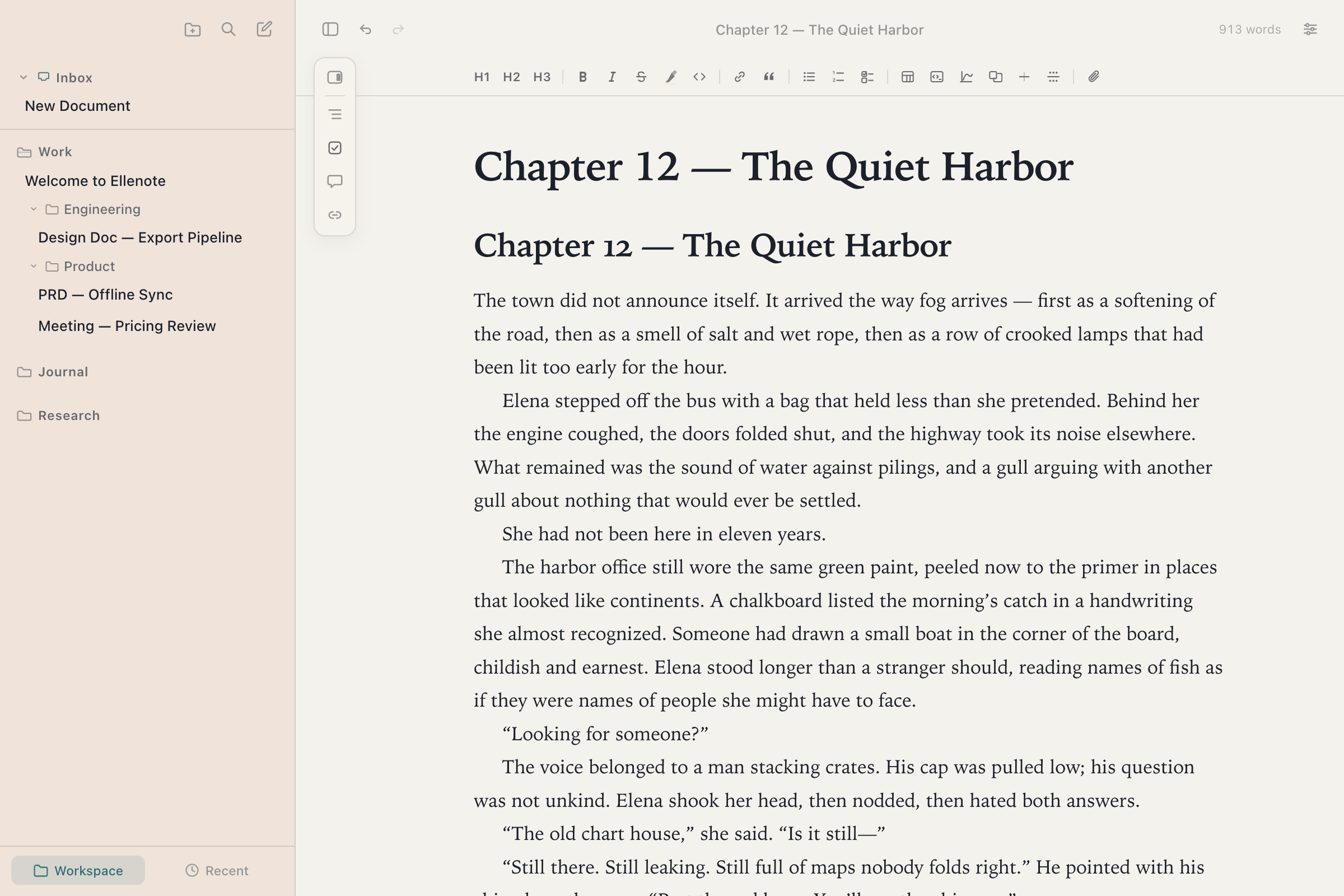
One of the first things I notice when opening a writing app is how the text feels on the page.
The width of a paragraph, the space between lines, the relationship between headings and body text, and the way a table sits alongside ordinary prose all influence how comfortable a document is to read.
These details may seem secondary to functionality, but they shape the experience of using an editor for hours at a time.
Good typography makes a document easier to follow. It helps establish a clear hierarchy without demanding attention. It can make a long piece of writing feel less overwhelming.
And yet, achieving a comfortable layout in many tools requires considerable experimentation.
I don't think everyone should need to understand typography to enjoy writing in a well-designed environment.
That's why I've been interested in treating typography as a complete experience rather than a collection of unrelated settings.
A carefully designed preset can make decisions about font choices, spacing, heading proportions, and overall rhythm together. Those choices should work as a system, not as a set of values the user has to fine-tune individually.
Of course, personal preferences still matter. Some people enjoy compact layouts; others prefer generous spacing. Some like the familiarity of a traditional document, while others want something more contemporary.
The point isn't to decide that one appearance is correct for everyone.
It's to offer a few considered starting points that already feel complete.
I want opening a document to feel like opening a place that's ready for writing, not a design project waiting to be finished.
Powerful Enough to Stay Out of the Way
There's a particular kind of frustration that comes from using a tool that works beautifully for simple tasks but becomes awkward the moment your needs grow.
A short note is easy. A long document with dozens of sections is another story.
Suddenly, navigation matters. Search matters. Editing performance matters. The ability to move between related files matters. A table that looked fine with three rows may become difficult to maintain with thirty.
These are not necessarily advanced requirements. They're ordinary consequences of doing more substantial work.
I think a writing tool should be able to grow with that work without requiring the user to adopt an entirely different way of working.
That doesn't mean every editor needs to become a full knowledge management platform. It means the fundamentals should remain dependable even when the document becomes more demanding.
A long document should still be pleasant to navigate. Editing a table should still feel direct. Searching for a sentence shouldn't interrupt the flow of writing.
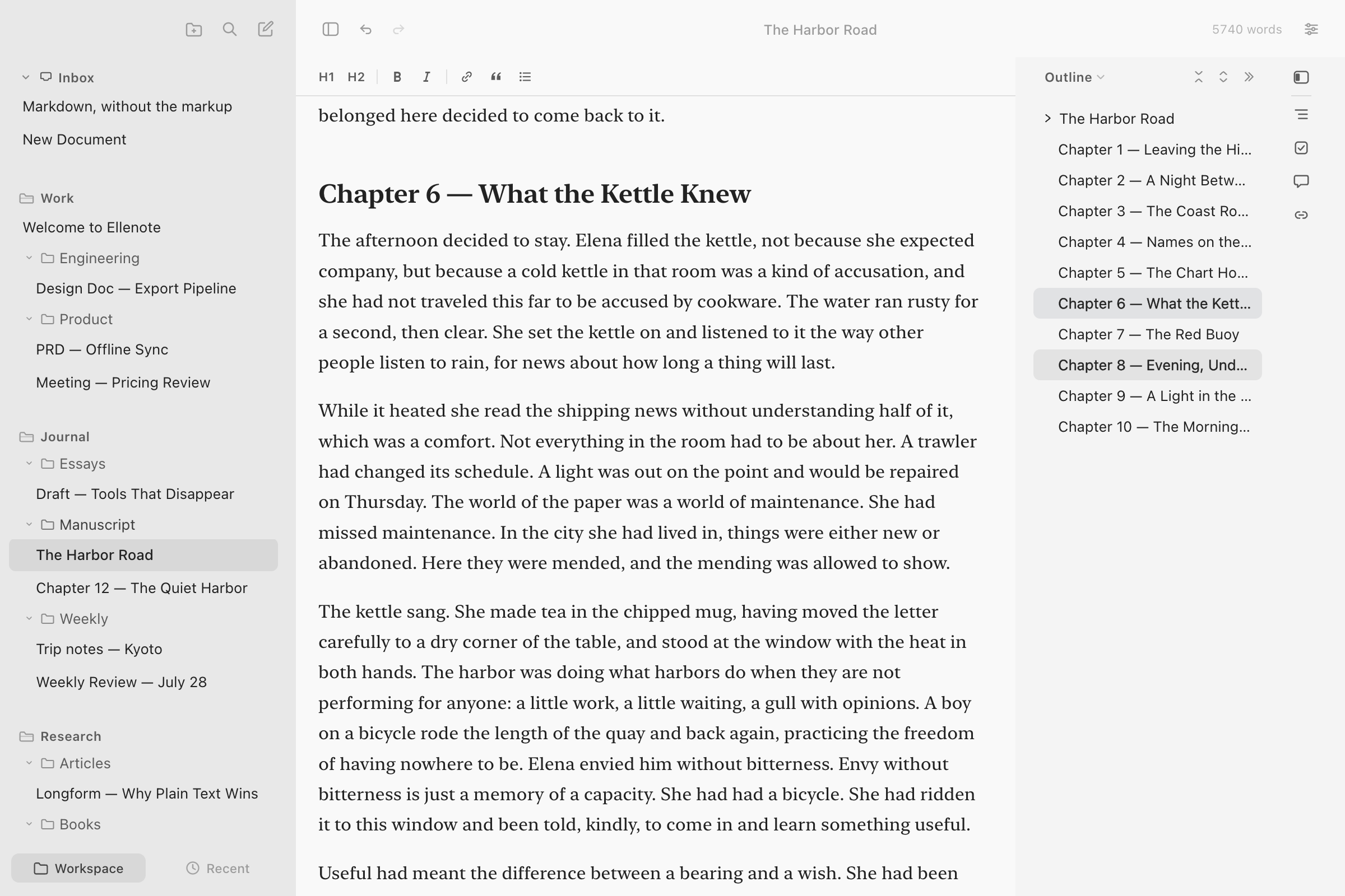
And adding those capabilities shouldn't make the everyday experience feel heavier.
This is a tension I keep returning to while building Ellenote: how do you make a tool more capable without making it feel more complicated?
I don't think there's a single answer. It's a question that has to be revisited with every feature and every design decision.
Sometimes the answer is a better interaction. Sometimes it's a sensible default. Sometimes it's making a feature available without giving it a permanent place in the interface.
And sometimes it's deciding not to add something at all.
Your Writing Shouldn't Depend on One App
There's another aspect of simplicity that matters to me, even though it isn't always visible in the interface: what happens to the writing itself.
Documents often outlive the software used to create them.
A note written today might still be useful years from now. A collection of research, technical documentation, or personal writing can gradually become something much more valuable than the application that holds it.
I don't want that content to become difficult to access simply because a product changes direction, introduces a new pricing model, or stops being maintained.
This is one reason I chose Markdown as the foundation for Ellenote.
Markdown files are plain text. They can be opened with different editors, stored in ordinary folders, backed up, and managed using familiar file tools. They don't need a proprietary database to remain readable.
But I also believe that choosing Markdown shouldn't mean accepting every inconvenience of writing Markdown.
The format is useful because it's simple and portable. That doesn't mean the editing experience has to revolve around remembering symbols or managing formatting syntax.
If I want to make a heading, I should be able to make a heading. If I want to edit a table, I should be able to work with the table itself.
The underlying file format should support the writing experience, not dictate it.
That combination—ordinary Markdown files and a more direct, visual way of editing them—is central to what I'm trying to build.
I want the convenience of a modern writing environment without making the content dependent on that environment.
Building Ellenote
Ellenote began with a fairly modest ambition: to create a writing environment I would genuinely enjoy using.
Not a system that tries to organize every part of my life. Not a platform that asks me to rethink how I work. Just a place where opening a document, reading it, and making changes feels natural.
As development continued, I realized how many details sit behind that seemingly simple goal.
Making an editor look clean is relatively straightforward. Making it remain clean while supporting real editing tasks is much more challenging.
Typography needs to work across different kinds of content. Navigation needs to remain useful as documents grow. Tables need to behave like tables. Markdown needs to remain readable and portable. And the editor needs to respond reliably, even when the work becomes more substantial.
Each of those requirements introduces complexity somewhere.
The challenge is deciding where that complexity belongs.
I don't think users should have to manage it just because implementing the alternative is difficult.
That's the principle I keep coming back to: the software can be complicated behind the scenes so that using it doesn't have to be.
Ellenote is still evolving, and I don't expect every decision to be perfect from the beginning. Building it has already involved reconsidering ideas, revisiting interactions, and discovering that apparently small details can make a significant difference.
But the direction remains consistent.
I want to build something thoughtful enough to feel comfortable immediately, capable enough to remain useful over time, and open enough that the writing never becomes trapped inside it.
Making Room for the Work Itself
I don't think powerful tools are the problem.
The possibilities they offer have changed how we write, learn, collaborate, and organize information. I appreciate that, and I wouldn't want to return to a world where software could do far less.
But I also don't think every possibility needs to compete for our attention.
There's value in a tool that makes sensible decisions, respects familiar workflows, and lets us concentrate on what we came to do.
For a writing app, that might mean an interface that doesn't demand constant attention, typography that feels right without hours of adjustment, and advanced capabilities that are available without getting in the way.
It also means remembering that the document matters more than the editor.
That's what I'm working toward with Ellenote.
Not simplicity by removing everything, but simplicity through careful decisions about what should be visible, what should be effortless, and what should quietly work in the background.
Because the best moment in a writing tool isn't when you notice how many things it can do.
It's when you stop thinking about the tool and become absorbed in what you're writing.
Ellenote is a Markdown editor for macOS and Windows, built around a direct writing experience, thoughtful typography, and files that remain yours.
Download free trial